Layout can both be one of the easiest and one of the trickiest facets of web design. Sometimes a designer can bust out an amazing layout in minutes and sometimes that same designer can struggle for the better part of day with the same task.
Each project is unique and calls for a unique solution, but I’ve found it helpful to keep a few rock solid and incredibly versatile alignments in mind that I can bust out when I get stuck. The ten layouts below should be enough to get you through even the worst cases of designer’s block when you can’t figure out the best way to arrange the content on your page.
Designers often stress out far too much about the layout process. We have a tendency to approach a project while thinking that it needs to be completely unique in every respect to be worth our time and the client’s money. However, if you have a good look around the web you’ll see that this isn’t necessarily the case. Great looking websites often use layouts that are fairly simple and not the least bit unique. It’s true that the pages we designers marvel at the most are often from the peculiar sites that break the mold, but your average client just wants something usable, clean and professional.
In this article we’re going to take a look at ten very common layouts that you can find on countless sites across the web. Notice that the way these sites are styled, meaning the colors, graphics and fonts, is unique, but the basic structure of the sites themselves are based on tried and true methods for laying out a webpage. We’ll emphasize this by first showing you a simple silhouette of the layout so that you can project your own thoughts and designs onto it, then we’ll follow it up with one or two examples of real sites that use the layout.
If you’re a web designer, bookmark this page and come back the next time you get stuck laying out a page. Keep in mind that each of the following layouts represents a basic suggestion for you to mold and modify. I encourage you to not use them as is but put your own spin on them based on the needs of your project.
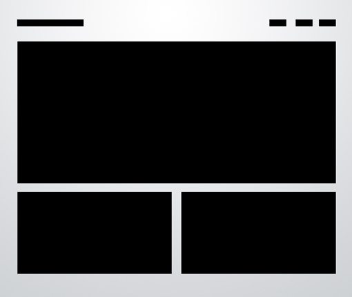
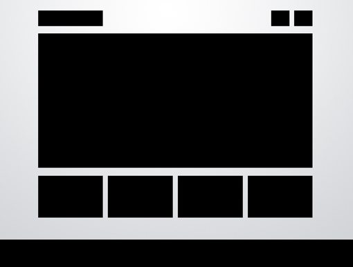
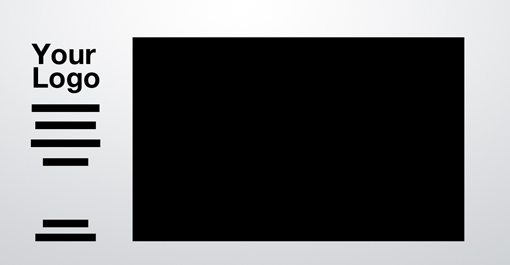
The three boxes layout features one main graphic area followed by two smaller boxes underneath. Each of these can be filled with a graphic, a block of text or a mixture of both. The main box in this layout is often a jQuery slider, capable of showcasing as much content as you want!
The silhouetted shapes along the top are areas that can be used for logos, company names, navigation, search bars and any other informational and functional content typically on a website.
 This design is ideal for a portfolio page or anything that needs to show off a few sample graphics. Each of the images could be a link that leads to a larger, more complex gallery page. Later in the article we’ll see how to mix this idea up even further.
Simple, effective and attractive. You can probably pull off a full, live web page with this layout in under an hour!

 Another place I see this trick used a lot is in pre-built themes. In these cases, a designer is selling a stock layout and really needs his/her placeholder graphics to shine, and nothing says cool and modern like some fancy 3D effects!

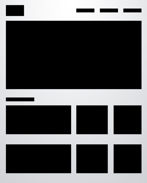
As with the three boxes example, there’s one primary graphic heading up the page. This is followed by a simple twist on the idea of a uniform grid of thumbnails. The space would allow for a span of four squares horizontally, but instead we’ve combined the first two areas so that the left half of the page differs from the right.
 As we mentioned with the first layout, the blocks don’t have to be images. For example, you can imagine this as blocks of text on the left flanking square images on the right.
Again, once you’ve got your basic layout in mind, you can make subtle changes like this while maintaining the integrity of the underlying structure. Another interesting trick they used was to split up the main graphic into two areas. It’s actually all one JPG, but it has been divided into two images to show off even more content.

 The result is a page that is bold, yet minimal and clean. The statement it makes is strong and impossible to miss, just make sure your graphic is good enough to be featured so prominently!


Obviously, as you add to the layout, the secondary items become smaller and smaller so for most uses, five boxes is probably going to approach the limit.
 Just as with the three box layout, this one is so versatile that it can literally be used on just about any type of site. Ideas for switching it up include adding a large background graphic, rounding the corners, adding shadows and/or reflections, or perhaps even adding an interactive element to the smaller thumbnails. You could easily add in buttons that cause them to scroll horizontally.
This drives home the argument that using one of the layouts in this article won’t kill your creativity. Once you’ve arranged the content, there’s still plenty to be done in the area of aesthetics. This is what will really define the site’s personality and often make or break a client proposal.


 The rest of the content can borrow from one of the other layouts on this list. Notice that I’ve again modified the three box layout, this time in a four box arrangement. Once you’re done reading this article, look at all the layouts again and think about how you can mix and match the ideas to create new layouts.


 This example uses squished rectangles to mirror the real site below, but this can and should be modified to fit whatever you’re showing off. The point here is to get you to think outside the box and not default to a square, maybe you could use vertical rectangles or even circles in your own gallery!
 The navigation might be the strongest in a left alignment, but feel free to experiment with a center or even right alignment to compliment the straight edge of the photo.
As an alternative, why not try to make a site that utilizes this same layout but with a vertically sliding image gallery? The space almost seems more suited for this as you won’t have to include an awkward cutoff area to protect the navigation.

 The key lies in the bottom half of the preview above. Notice that there’s actually a large container that holds a series of rectangles. This container provides you with the boundaries for your space, and all the content you place inside should be formatted in a strong but varied grid, not unlike the advanced grid layout near the beginning of this article.
However, it all fits tightly inside the grid that the designer has established. This layout is easily extendable so that no matter how much you throw at it, the overall appearance should remain fairly logical and uncluttered as long as you format and arrange your content properly.
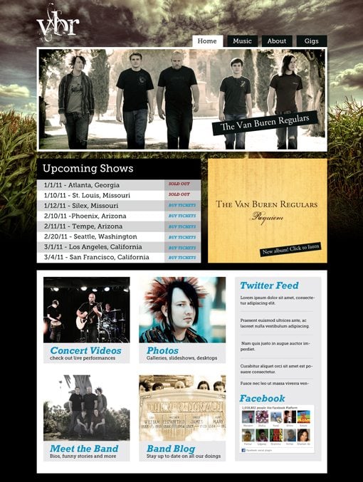
 This layout above heavily reminded me of a tutorial I wrote a while back on designing a website for a rock band. Here we have a very different looking page, but a nearly identical arrangement of content, especially in the lower half. The real trick to pulling this layout off right is to start with a few really big boxes, which are then broken up into smaller areas of content as needed.
If you’re still feeling lost, check out the full tutorial, which will walk you through every step of the process.
It can be really hard to read content when it is laid over a background image, so the basic idea here is to create an opaque (or nearly opaque) horizontal bar that sits on top of the image and serves as a container for links, copy, logos and other content.
 Rather than using the bar as one really wide content area, try splitting it into a few different sections. This can be done by varying the background color, adding some subtle vertical lines as dividers or even actually breaking the big box into smaller disconnected boxes as I’ve done above.

Next, the layout ideas presented above need not result in cookie cutter websites that all look the same, but instead merely provide you with a basic canvas on which to build a notably unique finished design.
Finally, the key to successfully implementing these ideas is to remember that they’re not set in stone. Each should be changed to fit your specific project and can even be mixed and matched to create new ideas!
Leave a comment below and let us know what you think of the layouts above. Are there any not mentioned above that you default to when you’re having trouble? Leave a link to an example.
Each project is unique and calls for a unique solution, but I’ve found it helpful to keep a few rock solid and incredibly versatile alignments in mind that I can bust out when I get stuck. The ten layouts below should be enough to get you through even the worst cases of designer’s block when you can’t figure out the best way to arrange the content on your page.
Keeping It Simple
Page layout is equal parts art and science. Creating something that’s visually attractive and unique takes an artist’s eye. However, there are several very easy to follow guidelines that you can use to create solid layouts that work for any number of cases. These principles include choosing and sticking to an alignment, structuring your whitespace properly and highlighting important elements through size, positioning, etc.Designers often stress out far too much about the layout process. We have a tendency to approach a project while thinking that it needs to be completely unique in every respect to be worth our time and the client’s money. However, if you have a good look around the web you’ll see that this isn’t necessarily the case. Great looking websites often use layouts that are fairly simple and not the least bit unique. It’s true that the pages we designers marvel at the most are often from the peculiar sites that break the mold, but your average client just wants something usable, clean and professional.
In this article we’re going to take a look at ten very common layouts that you can find on countless sites across the web. Notice that the way these sites are styled, meaning the colors, graphics and fonts, is unique, but the basic structure of the sites themselves are based on tried and true methods for laying out a webpage. We’ll emphasize this by first showing you a simple silhouette of the layout so that you can project your own thoughts and designs onto it, then we’ll follow it up with one or two examples of real sites that use the layout.
If you’re a web designer, bookmark this page and come back the next time you get stuck laying out a page. Keep in mind that each of the following layouts represents a basic suggestion for you to mold and modify. I encourage you to not use them as is but put your own spin on them based on the needs of your project.
Three Boxes
This is probably the most simple layout on the list. In fact, you’ll be tempted to think that it’s far too simple to ever fit your own needs. If this is the case, you’ll be surprised if you really put some thought into how versatile the arrangement really is.The three boxes layout features one main graphic area followed by two smaller boxes underneath. Each of these can be filled with a graphic, a block of text or a mixture of both. The main box in this layout is often a jQuery slider, capable of showcasing as much content as you want!
The silhouetted shapes along the top are areas that can be used for logos, company names, navigation, search bars and any other informational and functional content typically on a website.
In the Wild
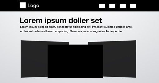
Below we see a beautiful implementation of the three box layout in Peter Verkuilen’s portfolio. As suggested above, the primary graphic rotates and displays a number of Peter’s recent projects. Clicking on one of the boxes will bring you to that project’s dedicated page where you can find out more information.Simple, effective and attractive. You can probably pull off a full, live web page with this layout in under an hour!
3D Screenshots
As developers continue to create an endless collection of webapps, the 3D screenshots layout seen below, or some variant of it, is becoming more and more popular. The basic idea is to top your page with a headline and then toss in some stylized previews of your application. These often come with reflections, heavy shadows, big background graphics, or even complex adornments such as vines crawling all over the screenshots, but the core idea is always really simple.In the Wild
Pixelworkshop uses this technique, not as a stock theme, but to actually showcase stock themes! Here the 3D screenshots swap out in a slideshow and come up in a number of different arrangements. Stop by and take a look to see all the various ways the designer presents the images.Advanced Grid
Many of the layouts that you’ll see in this article adhere to a pretty strict grid alignment. However, for the most part, they don’t simply suggest a page full of uniform thumbnails. For instance, the layout below mixes up the size of the images to avoid redundancy.As with the three boxes example, there’s one primary graphic heading up the page. This is followed by a simple twist on the idea of a uniform grid of thumbnails. The space would allow for a span of four squares horizontally, but instead we’ve combined the first two areas so that the left half of the page differs from the right.
In the Wild
In the gorgeous example below, this layout is used for a children’s clothing website. Notice that near the bottom of the alignment, they’ve switched things up even further so that the left side features an almost oddly-sized image followed by a paragraph, neither of which perfectly line up with the content on the right side.Again, once you’ve got your basic layout in mind, you can make subtle changes like this while maintaining the integrity of the underlying structure. Another interesting trick they used was to split up the main graphic into two areas. It’s actually all one JPG, but it has been divided into two images to show off even more content.
Featured Graphic
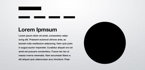
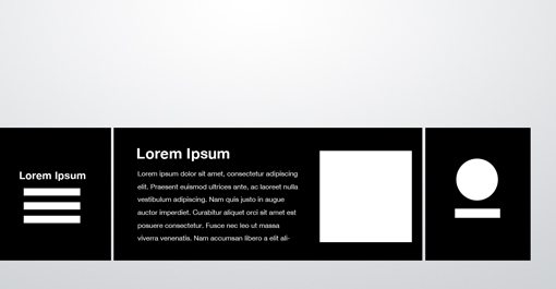
Sometimes you don’t have enough content for a page full of images. So what do you do if you want to showcase one icon, photo or perhaps even a symbol such as an ampersand? The layout below is a super easy solution that is quite popular and reads very well due to the lack of distractions.In the Wild
Just how common is this layout? A lot more than you might think! With minimal effort I was immediately able to come up with two sites that use some close variant of this technique. Notice that you have options for how you want to format the text and even where you want to place the navigation. The second site rearranges the secondary elements quite a bit but it’s instantly recognizable as the same basic layout.Five Boxes
The five boxes layout is simply an evolution of the three boxes layout. All of the same logic applies, it’s just been modified to hold even more content. It could easily be four boxes as well, it just depends on what you want to showcase. It also makes it look like you put a little more effort into the design!Obviously, as you add to the layout, the secondary items become smaller and smaller so for most uses, five boxes is probably going to approach the limit.
In the Wild
Here again we have two examples of this layout being used in slightly different ways. The big thing to notice here is that despite having similar layouts, these two sites almost couldn’t appear more different from each other if they tried. One uses a hand drawn illustration style, the other photographs and gradients. The first one uses muted colors and script fonts, the second bright colors and modern fonts.This drives home the argument that using one of the layouts in this article won’t kill your creativity. Once you’ve arranged the content, there’s still plenty to be done in the area of aesthetics. This is what will really define the site’s personality and often make or break a client proposal.
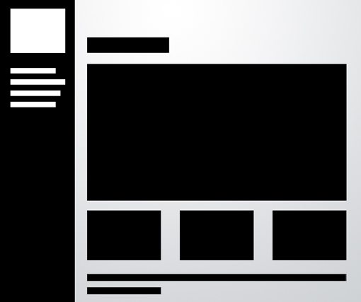
Fixed Sidebar
Thus far all the sites that we’ve seen have had a top-side horizontal navigation. The other popular option is of course a vertical navigation, which lends itself to creating a strong vertical column on the left side of the page. Often this is a fixed element that stays where it is while the rest of the page scrolls. The reason for this is so the navigation can stay easily accessible from any point in the site.In the Wild
As with the previous example, the two sites below actually look very different, even from a layout standpoint. However, if you look again you’ll notice that they both use a left-side vertical sidebar and the four box layout. The second example has simply moved the smaller boxes to the top of the page! Yet another interesting idea that you should keep in mind when creating a site based on these examples.Headline & Gallery
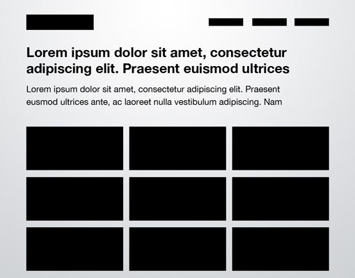
Everyone loves a good gallery page. From a layout perspective, what could be simpler? All you need is a solid, uniform grid of images and some room for a headline with an optional sub-head. The key here is to make your headline big and bold. Feel free to use this as a point of creativity and include a script or some crazy typeface.In the Wild
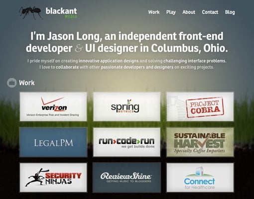
The developer below used this design to create a gallery of the logos for clients that he has worked with. Notice that he’s not suggesting that he created the logos, but is simply showing off his client base in a very visual fashion. This goes to show that even if you’re not a designer, a thumbnail gallery might be a great way to showcase an otherwise plain and boring list of items.Featured Photo
The layout below is extremely common, especially among the photography community. The basic idea here is to have a large image displaying either your design or photography (anything really), accompanied by a left-side vertical navigation.In the Wild
The site below really makes the most of this layout by turning the one featured image into a horizontal slider. One image is featured at a time but you can see the next one peaking onto the right side of the page. When you hover over this, an arrow appears that allows you to slide through the photos.As an alternative, why not try to make a site that utilizes this same layout but with a vertically sliding image gallery? The space almost seems more suited for this as you won’t have to include an awkward cutoff area to protect the navigation.
Power Grid
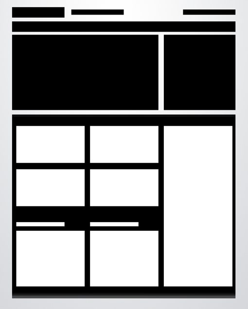
The power grid is the most complex layout in this article, but it is one of the most effective layouts I’ve seen for pages that need to contain all kinds of various related content. From images and music players to text and videos, you can cram just about anything into this layout and it stays strong.In the Wild
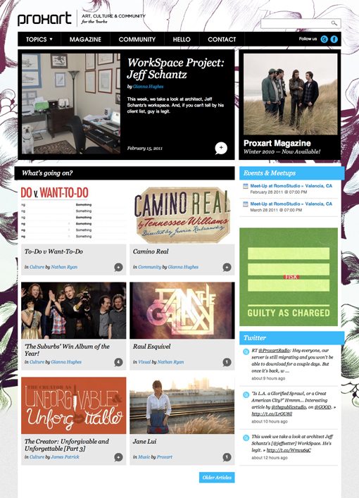
This one can be really hard to wrap your mind around until you see some live examples. The first is a showcase of art and culture. That description alone tells us that the content is going to be all over the board, and indeed we see that the page is filled with Twitter feeds, photos, lists, images and more.However, it all fits tightly inside the grid that the designer has established. This layout is easily extendable so that no matter how much you throw at it, the overall appearance should remain fairly logical and uncluttered as long as you format and arrange your content properly.
If you’re still feeling lost, check out the full tutorial, which will walk you through every step of the process.
Full Screen Photo
The final layout on the list is another that is ideally suited for photographers, but will work on any site with a big, attractive background graphic to display and a limited amount of content.It can be really hard to read content when it is laid over a background image, so the basic idea here is to create an opaque (or nearly opaque) horizontal bar that sits on top of the image and serves as a container for links, copy, logos and other content.
In the Wild
This layout might feel incredibly restrictive, but below we get a glimpse into just how much it can hold. This photography site fills the bar with navigation, an “About” block of text, a few recent photos with descriptions and a large logo! Not bad for such a small space, and it pulls all this off in a very clean and non-cluttered way.Conclusion
There were a few key points made above that I want to reiterate in closing. First, even though page layout definitely isn’t necessarily a “one size fits all” practice, there is a science to it that can be quickly and easily applied in an incredibly vast number of circumstances.Next, the layout ideas presented above need not result in cookie cutter websites that all look the same, but instead merely provide you with a basic canvas on which to build a notably unique finished design.
Finally, the key to successfully implementing these ideas is to remember that they’re not set in stone. Each should be changed to fit your specific project and can even be mixed and matched to create new ideas!
Leave a comment below and let us know what you think of the layouts above. Are there any not mentioned above that you default to when you’re having trouble? Leave a link to an example.
No comments:
Post a Comment